Enhancing Mobile Conversion Through User-Centered Design
Role: Senior Product Designer – Mobile Web
Timeline: 10 weeks
Objective: Optimise Sage’s mobile product detail pages (PDPs) to boost engagement and conversions.
Approach:
Restructured page into modular, scannable content blocks
Simplified pricing tiers and clarified messaging hierarchy
Introduced sticky CTAs and personalised content sections
Validated with A/B testing and analytics review
Outcomes:
+15%
improvement in mobile
conversion rate
-23%
reduction in mobile bounce rate

Context
Sage, a leading provider of accounting software, observed that its mobile product detail pages (PDPs) were underperforming compared to desktop versions. With mobile traffic constituting over 60% of total visits, the company aimed to optimize the mobile PDP to improve user engagement and conversion rates.
Challenge
Sage’s existing mobile PDPs struggled with:
Unstructured layouts that made content overwhelming
Confusing pricing tiers leading to drop-offs
Low engagement on key sections such as reviews and FAQs
High bounce rates due to poor scannability
These issues directly impacted conversion, with mobile underperforming compared to desktop.
Process
To diagnose and frame the problem:
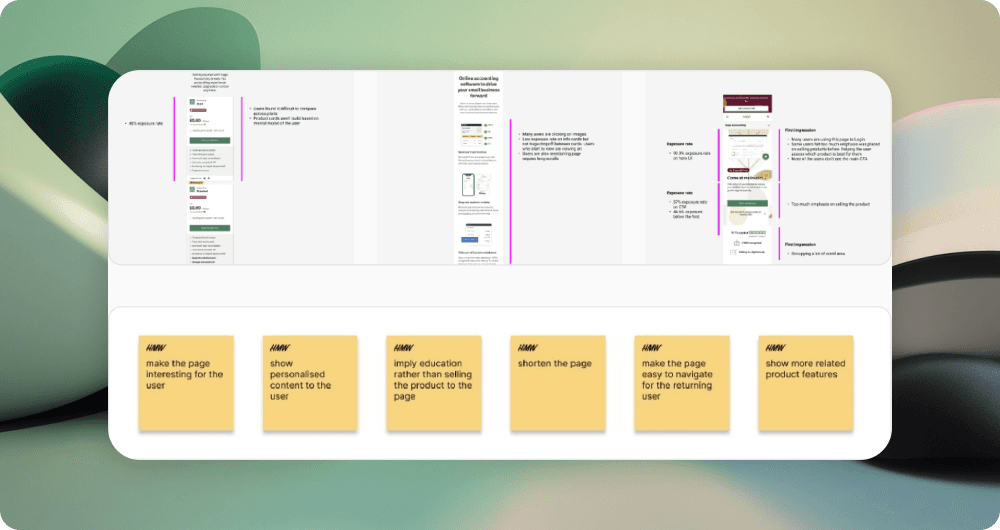
Conducted heuristic evaluations of existing PDPs
Analysed Google Analytics data for bounce/exit rates
Reviewed Hotjar recordings to observe interaction issues
Benchmarked against leading SaaS and e-commerce product pages
Insight: Mobile users were abandoning early not because of content gaps, but because content wasn’t structured for scanning and decision-making.

Key UX Problems & Solutions
Problem: Mobile PDPs underperforming compared to desktop (high bounce, low conversion)
Solution: Ran A/B tests on redesigned mobile PDP layouts, focusing on content hierarchy, sticky CTAs, and simplified flows
Impact: +15% increase in mobile PDP conversions
Problem: Content lacked clear scannability on mobile
Solution: Applied mobile-first modular structure (benefits, features, pricing, reviews)
Impact: Reduced bounce rate by –23%
Conclusion
This project reinforced how content structure is as important as content itself. By making PDPs modular, scannable, and contextually personalised, we turned mobile from a weak point into a competitive strength.