Case Study: Multi-Brand Design System for Net-a-Porter & Mr Porter
Role: Senior Product Designer – Contract (YNAP via Mindera)
Timeline: 4 months
Team: 5 designers + engineers
Goal: Create a scalable, token-based design system that supports both Net-a-Porter and Mr Porter, aligning navigation, theming, and brand consistency across five platforms.
Approach:
Audited existing UI and navigation inconsistencies
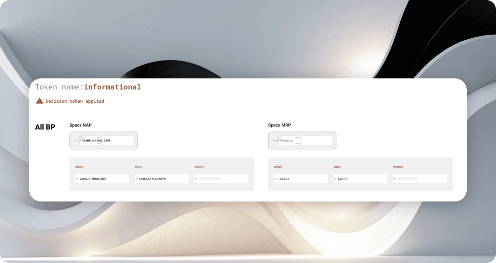
Defined semantic decision tokens to encode brand theming
Rebuilt core components and navigation headers for multi-brand use
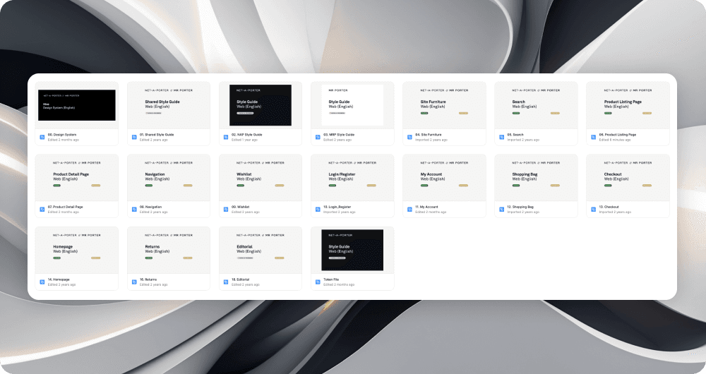
Delivered three Figma libraries and seven template pages
Mentored team of five to ensure scalability and adoption
Outcomes:
Unified design language across two global luxury brands
3 libraries + 7 templates supporting 5 platforms
40% reduction in developer handoff friction
Design system now acts as a foundation for future brand scalability
Challenge
Net-a-Porter and Mr Porter shared platform infrastructure but had fragmented design systems:
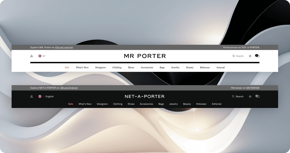
Navigation headers were structurally inconsistent across brands
Theming lacked scalability, requiring redundant design work
Developers faced friction when re-using components
Brand identity risked dilution due to inconsistent implementation
Results
Brand Themes Supported: 2 (Net-A-Porter, Mr Porter)
Decision Tokens Introduced: Component-specific tokens (e.g.,
--Accordion-title-font) ensuring correct theming across both brands .Component Libraries Created: 3 distinct libraries for streamlined implementation .
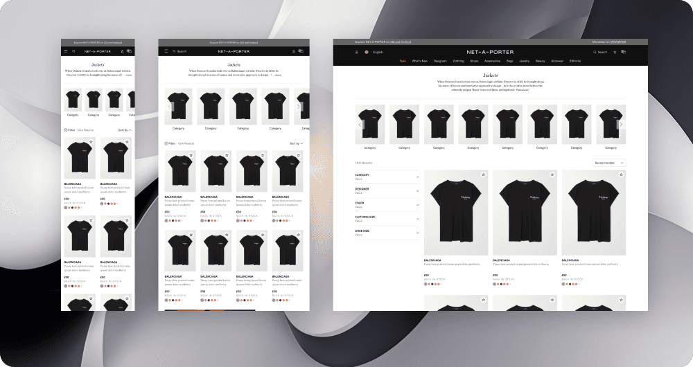
Key Page Templates Delivered: 7 (Homepage, Product Listing, Product Detail, My Account, Returns, Whishlist, Basket) across 5 platforms (Desktop, Tablet, Mobile Web, iOS, Android) .
Design Team Size: 5 designers (led by me), supporting global localization efforts .
Research & Discovery
To uncover the pain points:
Conducted UI audits of both brand ecosystems
Interviewed developers & stakeholders to understand handoff challenges
Benchmarked against other multi-brand design systems
Documented theming inconsistencies and navigation divergence
Insight: The lack of a semantic token layer and unified navigation system was causing wasted effort, redundancy, and brand confusion. .
Design Process
1 - Audit & Alignment
Mapped existing UI inconsistencies and theming conflicts
Documented navigation structures across brands
2 - Token Strategy
Introduced semantic decision tokens for typography, color, and spacing
Created rules for scalable brand theming
3 - Component Reconstruction
Rebuilt navigation headers and shared components for dual-brand use
Ensured accessibility and performance alignment
4 - System Delivery & Mentorship
Delivered 3 Figma libraries + 7 templates across 5 platforms
Mentored team of 5 designers to ensure scalability, consistency, and adoption .
Key Problems & Solutions
Problem: Fragmented navigation headers across brands
Solution: Rebuilt multi-brand header system with scalable token architecture
Impact: Consistent UX across Net-a-Porter & Mr Porter
Problem: Redundant theming and duplicated effort
Solution: Introduced semantic decision tokens for typography, color, spacing
Impact: 40% reduction in dev handoff time
Problem: Lack of scalability for new platforms
Solution: Delivered 3 libraries + 7 templates designed for reuse
Impact: Future-proof system across 5 platforms
Problem: Limited design ops maturity
Solution: Mentored 5-designer team and embedded scalable workflow practices
Impact: Improved collaboration and system adoption
Conclusion
This project underscored the challenge of balancing brand uniqueness with system consistency. By abstracting brand theming into tokens, we enabled Net-a-Porter and Mr Porter to maintain distinct voices within a unified structure.
What I Learned:
Semantic tokens accelerate both design and development adoption
Leading a team through system governance is as important as component delivery
Scalability requires designing not just for today, but for tomorrow’s unknown platforms